Offset the Early Access Information "Start" Button from the "Exit Game" Main Menu Button
The "Start" button on the Early Access Information page lines up exactly with the "Exit Game" button on the Main Menu. This means if I double-click, or otherwise am imprecise with my clicking, I press the "Start" button, then immediately click the "Exit Game" button.
If these two buttons were not located on top of one another, I would not exit the game when I expected to start it!
My resolution is 3440x1440
Comments: 20
Oldest
•
Newest
•
Most likes
•
Fewest likes
-
11 Apr, '23
Blair MergedI can be very dumb....
So the "Start!" button when selected lines up where the "exit game" button is when you select it, causing that if i double click by mistake i will start then instantly exit the game.
So moving the button or add a confirmation on exit game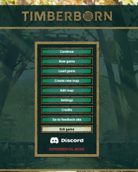
-
06 May, '23
Jcheung System"Don't have the Start! and Exit Game buttons in the same screen location on consecutive menus" (suggested by Ersiusp on 2023-05-04), including upvotes (2) and comments (0), was merged into this suggestion.
-
08 May, '23
Jcheung System"Early Access overlay close-button is in same screen location as the Exit Game button" (suggested by madison taylor on 2023-05-06), including upvotes (1) and comments (0), was merged into this suggestion.
-
11 Jul, '23
TronSolo MergedWhen you click on the start button, your mouse pointer ends up almost on top of the exit game button. I suggest moving the exit game button to the bottom of the screen. Take it right off the list it's on and put it on its own at the bottom.
-
12 Jul, '23
Jcheung System Merged"Start button position change needed" (suggested by TronSolo on 2023-07-11), including upvotes (1) and comments (0), was merged into this suggestion.
-
12 Jul, '23
Jcheung System"Early access start button" (suggested by Blair on 2023-04-11), including upvotes (3) and comments (2), was merged into this suggestion.
-
18 Sep, '23
Bbutton Mergedin the startup menu, "start" and "exit Game" should be in different areas. I often double click by accident (shakeyboi) and exit straight out of the game on startup.
-
18 Sep, '23
Gin Fuyou System""start" and "exit Game" should be in different areas" (suggested by Bbutton on 2023-09-18), including upvotes (1) and comments (0), was merged into this suggestion.
-
08 Oct, '23
Alvaro MergedI just wanted to say one thing, when the initial message appears and at the bottom the 'start' button is just aligned with the 'quit game' button on the main menu, I'm a little anxious, but it has happened to me on several occasions that I close the game accidentally by double clicking
-
08 Oct, '23
Gin Fuyou System"suggestion: the 'start' button is just aligned with the 'quit game' button on the main menu" (suggested by Alvaro on 2023-10-08), including upvotes (1) and comments (0), was merged into this suggestion.
-
27 Oct, '23
Tak Mergedsometimes, I accidentally click 'exit game' button because it's too close to the okay button of the warning displayed before the main menu. Simply move the exit button to below by 50 to 150 pixels.
-
02 Nov, '23
Gin Fuyou System"move exit game button to below" (suggested by Tak on 2023-10-27), including upvotes (1) and comments (0), was merged into this suggestion.
-
02 Nov, '23
fauxfire Mergedthe initial game message, which is fine, should be moved so the button isnt above exit game. if my game lags at all i end up hitting it more then once and the game then closes
-
04 Nov, '23
Gin Fuyou System"initial game message" (suggested by fauxfire on 2023-11-02), including upvotes (1) and comments (0), was merged into this suggestion.
-
27 Dec, '23
Michael Mergedi dont mind the start up notification etc..... neither i particulary care about the layout of the menu......
but u made the first notification overlap the close game button which is really annoying sometimes -
03 Jan, '24
Gin Fuyou System"change button position" (suggested by <Hidden> on 2023-12-27), including upvotes (1) and comments (0), was merged into this suggestion.
-
01 Feb, '24
Anoplexian MergedPlease for the love of all that is good, move the box that denotes the game is still in Early Access up a bit. It's HORRIBLE when if you click, and there's a slight lag as the menu loads after clicking ok, you can actually accidentally exit out of the game entirely.
It's such a small change, but its across a large portion of the bottom of the click box. -
07 Feb, '24
Gin Fuyou System"Move the intro box for early acces up a bit" (suggested by <Hidden> on 2024-02-01), including upvotes (1) and comments (0), was merged into this suggestion.
-
17 May, '24
Gianluca Mergedthe button that lets you in on the menu is pretty near the go to desktop one that appears once you log onto the menu, could you separate them more? I close the game by accident sometimes.
-
18 May, '24
Jcheung System"welcome screen" (suggested by <Hidden> on 2024-05-17), including upvotes (1) and comments (0), was merged into this suggestion.
