Building Info windows in center of screen disturbs construction (Relocate move or collapse toolip)
Is it just me? This keeps happening: I go to build, say, a lodge-- figure out exactly where I have space for it, go thru the toolbar to open the lodge-placement tool-- and bam! My lower-center-middle-of-screen focus area is covered by the various lodge-related text boxes, and I have to move the view around and find those exact four squares I wanted again.
It's a minor gripe and I love the game! But as y'alls are taking feedback, this is mine and it has proven an Annoyance :/
Thanks!
Comments: 95
Oldest
•
Newest
•
Most likes
•
Fewest likes
-
24 Sep, '22
Gin Fuyou System MergedHighlighted comment
"Tooltip Location" (suggested by Boomhowitzer on 2022-09-23), including upvotes (1) and comments (0), was merged into this suggestion. -
23 Sep, '21
FuryoftheStars MergedThe description box of the currently selected item/tool to build/use is kind of in the way being in the middle. Maybe move it off to the right, and then you can move it down some, too, without the build costs under it, now.

-
24 Sep, '21
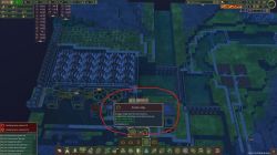
FuryoftheStars MergedOh, won't let me edit and add a picture after the fact.
Here, to give a better idea of what I'm talking about and why: https://imgur.com/iHR95dm
As I like working center screen, I feel as though this box is interfering where it is.
And yes, I'm on an ultra-wide when I took that screenshot, but it's still an issue (and could still work being moved) on standard 1920x1080 screens. -
04 Oct, '21
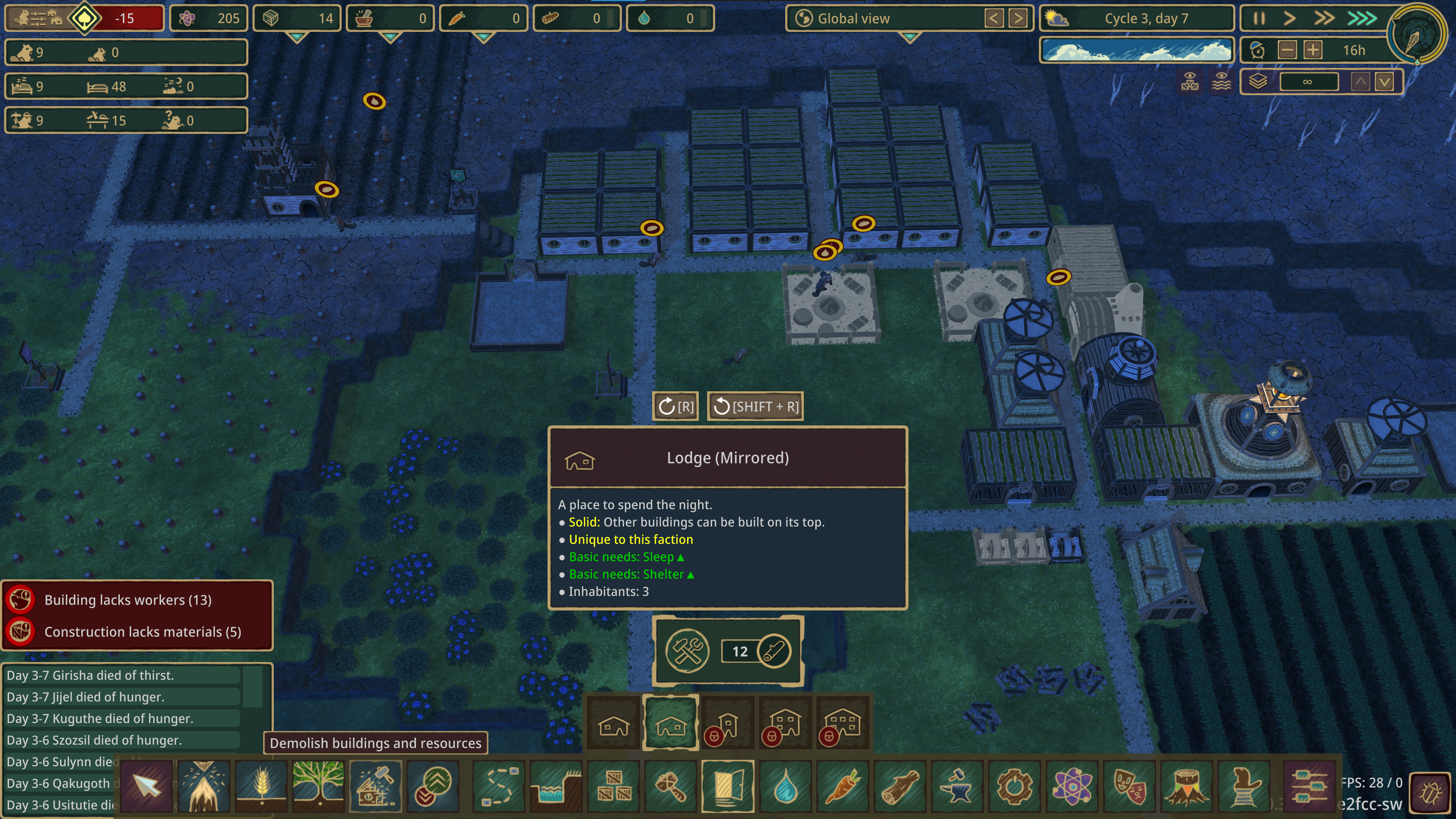
Jose MergedWhen building or doing any action, the info window gets in the way of your view when you try to select an action. Depending on what you want to do (like building) the window info is so big, I have to pan the camera around just to see where I could place the building.
It would be better to have that info window appear on the left side of the screen since it's empty most of the time, that way I don't have to pan the camera around or unclick the building action just to see where I want to place it. -
22 Oct, '21
DeejooI agree 100%. I am amazed that that doesn't bother players anymore. I too would like to be able to move this notice to another place.
-
12 Nov, '21
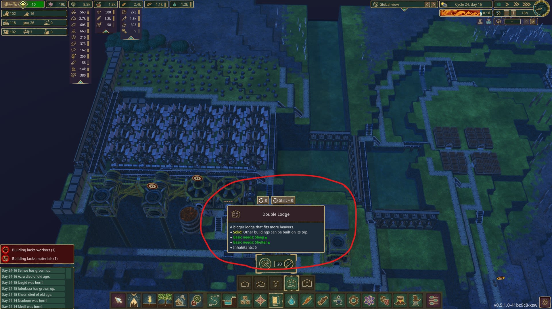
Astinus MergedBuilding tooltips currently stack in the center, often obscuring the location for object placement.
I'd prefer to see them in the lower right.
I play in 21:9 -
14 Nov, '21
Gin Fuyou System"Tooltip Relocation" (suggested by Astinus on 2021-11-12), including upvotes (1) and comments (0), was merged into this suggestion.
-
06 Jan, '22
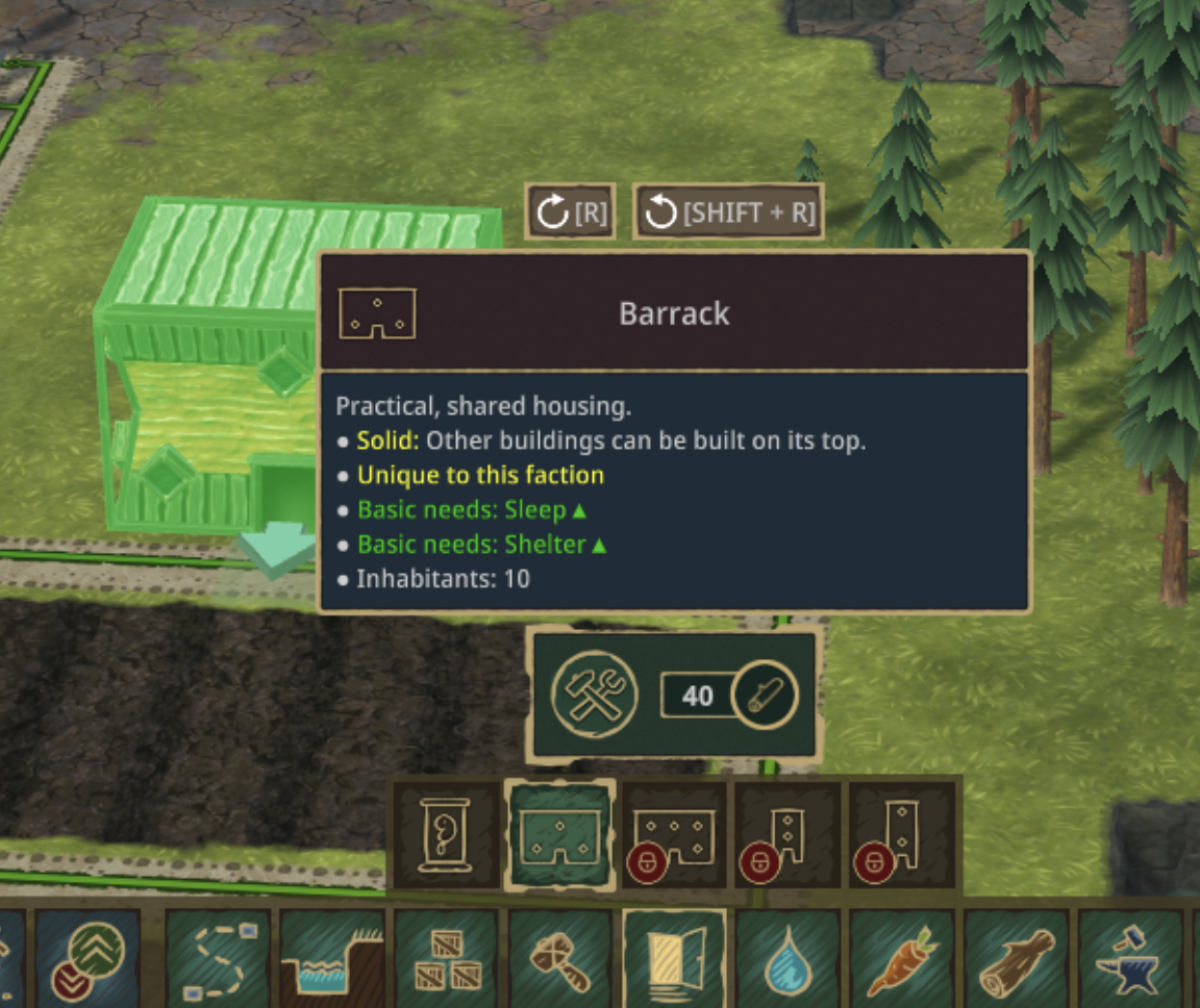
Solas MergedWhen building, say... lodges, the popup description is right in the middle of the dcreen and takes up a bunch of space right in the area I'm trying to work. It would be nice to be able to minimize the details window to see what I'm working on
-
06 Mar, '22
Kona-Kai MergedWhen I select to build something, the build menu pops up right in the center of the view at the bottom of the screen... right where you are looking to build. I should not have to move camera angle in order to select build sight.
Either the menu needs to disappear from UI once I have chosen what to build, or I need to be able to move where the menu items open up (and the UI needs to retain that until I change location again)
Opening to left or right side would be more user friendly, but best option is the menu disappears once I select what I am building so I can simply place it.
-
07 Mar, '22
Lootypants MergedI agree!
The camera and UI is pretty ok I think, but that menu and the many small options like all the bridge-things or the platform-height things, need a smarter solution. -
27 Mar, '22
Luke MergedWhenever you click on a structure to build, the pop-up description box obstructs the center of the field of view. For example, if you want to place a structure where you're currently looking, the description box blocks you from placing the structure without first moving the camera.
-
27 Mar, '22
Gin Fuyou System"Move item description pop-ups away from the center of the field of view" (suggested by Luke on 2022-03-27), including upvotes (1) and comments (0), was merged into this suggestion.
-
09 Sep, '22
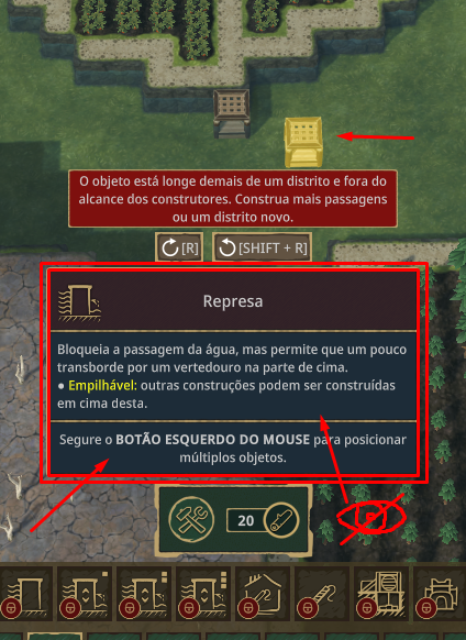
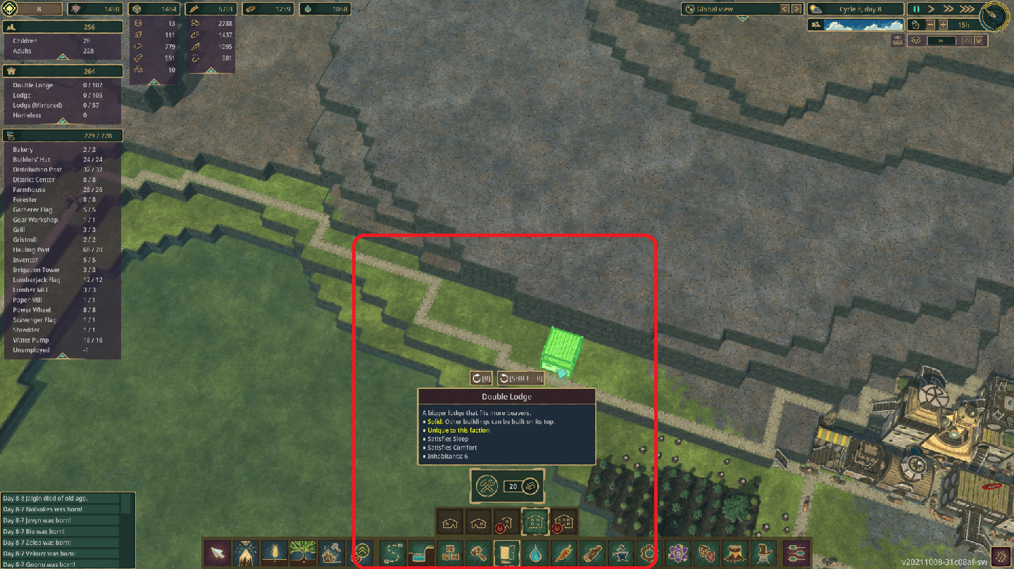
tippyc Merged[see image] I've often been frustrated by this information box when building. It blocks a significant amount of area neat the center of the screen. I'm constantly having to move the camera to avoid this box. I understand why you want it to be in that location when you mouse over build items. However, after you select a build item, it gets in the way of where you might want to place the item. So the suggestion is: after i select a build item, move the information box to the edge of the screen.
-
10 Sep, '22
Gin Fuyou System Merged"Suggestion: free up screen real estate" (suggested by tippyc on 2022-09-09), including upvotes (1) and comments (0), was merged into this suggestion.
-
23 Sep, '22
Boomhowitzer MergedThe tooltip sits right in the middle of the lower part of the screen. A fair amount of the tooltips are so large that they take up part of the building area on the screen. Generally speaking, people rarely use the sides of the screen for more than looking around, placing pinned windows, looking at inventory, etc. The main part of the screen is the middle half where the game is focused and that is where most people do their building and work. I find myself having to constantly move the camera around in order to work around the tool tip. Some of the tips are between a quarter and a third of the way up the screen. It becomes even more apparent when you are older like myself and need to increase the size of the UI in order to read the text on the screen 😂 The item's resource cost box is fine where it is, I suggest moving the tool tip to the lower right side of the screen by the MENU button or an option to move the box in the settings or even have the tooltip disappear after selection
-
24 Sep, '22
Gin Fuyou System Merged"Info Window" (suggested by Jose on 2021-10-04), including upvotes (2) and comments (1), was merged into this suggestion.
-
24 Sep, '22
Gin Fuyou Admin MergedWhich overlay do you mean? Farm range? Or crops "ghosts" on the screencap? If so, could you please explain the reason, I'm not seeing the benefit atm.
-
24 Sep, '22
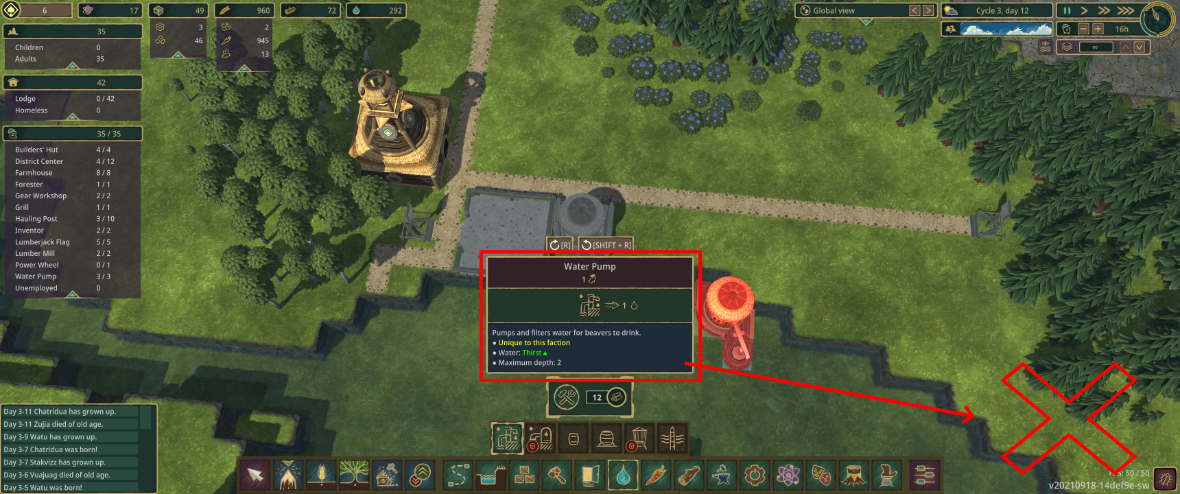
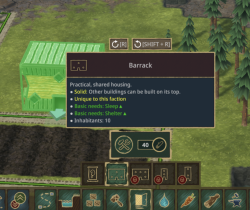
Axe Murderer MergedWhen you select one of the build buttons from the toolbar at the bottom of the screen, a secondary toolbar appears above it. If you click a button on this secondary toolbar, a build popup tip appears. This popup tip is poorly positioned in the display. Actually, it is a group of tips not just a single one. There is a main tip box, the largest one, displaying the object name and traits. Below that is another tip that has the resource cost to build it. And there is another below that one which displays the cost in science points needed to unlock the tech. This stack of tips appears aligned horizontally centered, and vertically justified to the bottom of the display as much as possible. If you sum up the vertical dimensions of these tip boxes, the result is between about 1/3 to 1/2 the total height of the display window. So, when visible, they almost obscure the center of the screen. It's right where I want to build things.
Shift the tip stack sideways to clear the center please. -
25 Sep, '22
Gin Fuyou System"Build Popup Tips- They interfere with building things." (suggested by Axe Murderer on 2022-09-24), including upvotes (1) and comments (0), was merged into this suggestion.
-
26 Sep, '22
Axel MergedThe farm info of "Zanahoria" / "Carrot" is more than 1/3 of the screen (UI) and it doesn't disappear. It is complicate when you want to put it in place massively 😛
Some buildings info disappear when I move the mouse, not being the case for all the structures -
11 Nov, '22
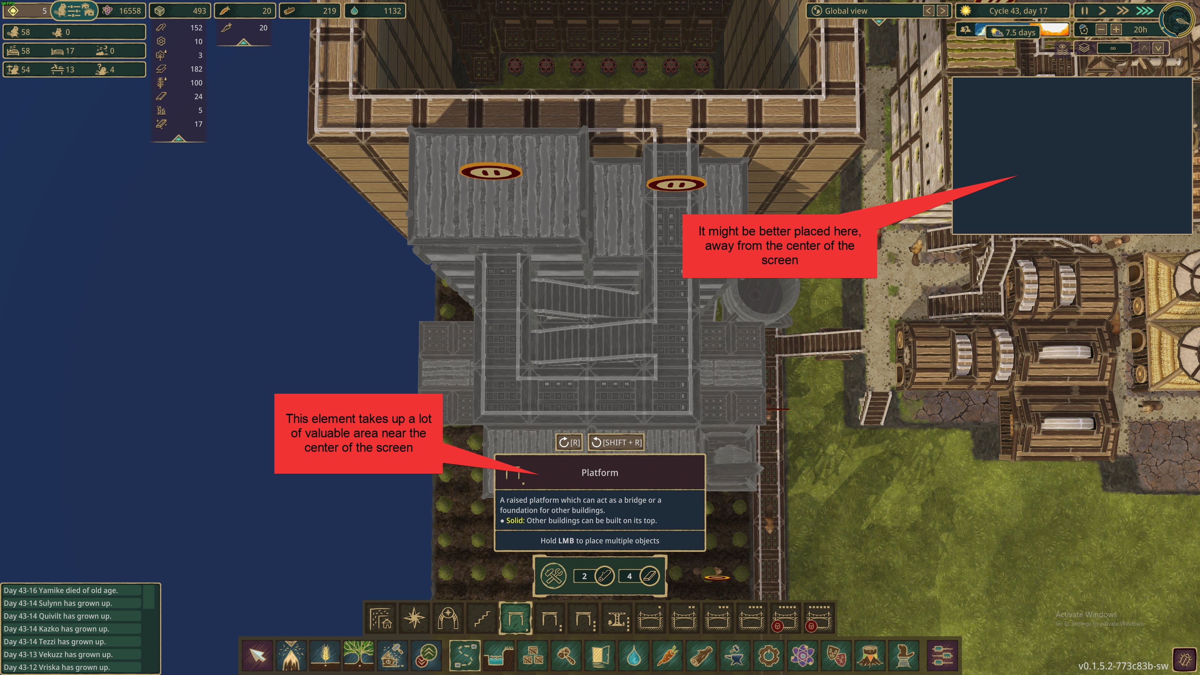
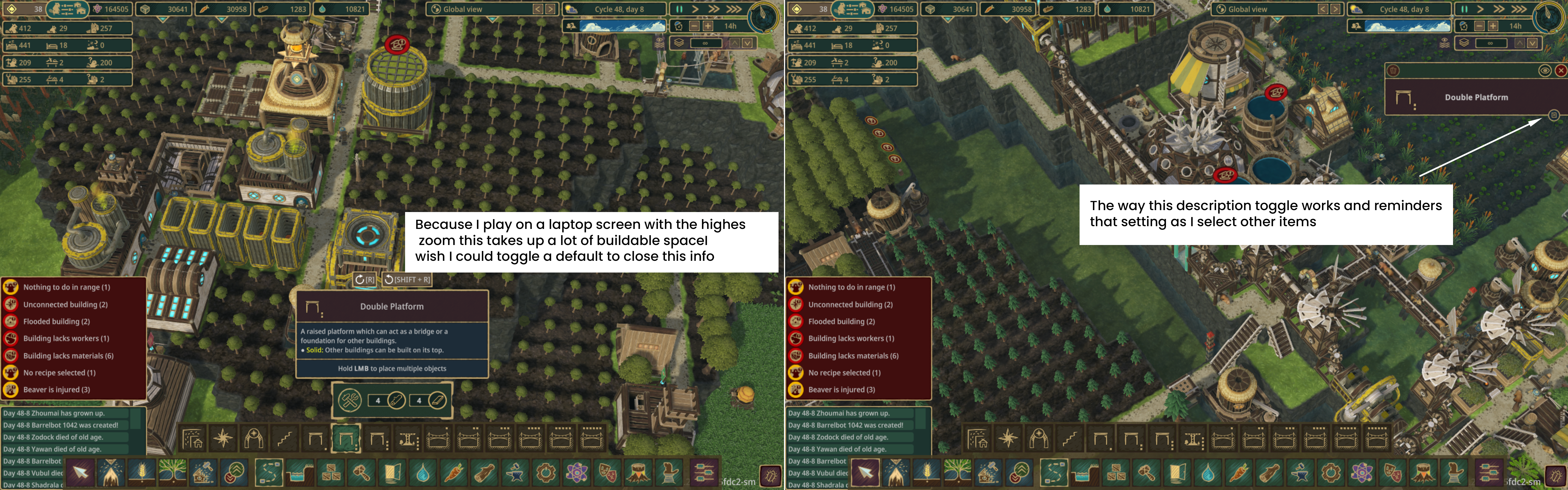
PocketBever MergedAnother option would be to apply the same description toggle mechanism that the built item info panel uses. That way the info is open by default but once you're familiar with an item the description can be collapsed for more build area.
I play on a laptop with a 1440x900 screen resolution and the Timberborn UI scale at about 130% so I can read the text, but that makes this info take up a lot of buildable space.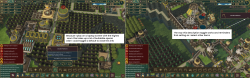
-
10 Dec, '22
bwoods MergedThe building description box (the thing that says stuff like what it does, that's it's solid, that it's unique to the faction) is useful, but it can also get pretty large and take up a lot of screen space that I want to see when I'm placing buildings. I would love to only see the long form description while hovering over the button for that building but not when I am placing buildings on the map.
-
14 Dec, '22
Gin Fuyou System Merged"UX: Hide description box while placing things" (suggested by bwoods on 2022-12-10), including upvotes (1) and comments (0), was merged into this suggestion.
-
14 Dec, '22
Gin Fuyou System Merged"Move structure details window when building from center to a side of the screen (construct tooltip)" (suggested by Solas on 2022-01-06), including upvotes (6) and comments (7), was merged into this suggestion.
-
24 Dec, '22
Timothy MergedWith my resolution at 3840x2160, and the UI scale at 140%, the build menu widget that explains the thing I'm building gets in the way, heavily. I find it makes building awkward. While I could fix this by reducing my UI scale, I don't have the best eye sight, so 140% is almost necessary for me.
One solution would be to make the explanatory widget only show when hovering over the buildings icon and, once clicked on with intent to build, it goes away.
-
27 Dec, '22
Gin Fuyou System"Build Menu Blocking View" (suggested by Timothy on 2022-12-24), including upvotes (1) and comments (0), was merged into this suggestion.
-
27 Dec, '22
Timo MergedDear development team,
First of all, a huge thanks for this time-consuming creation of a building game. In my almost 100 hours of gameplay, Timberborn has totally caught me.
As a tiny improvement, I wish that the position of the building menu window can be moved. Often the building description covers exactly the area where I want to place the new building. Otherwise, I can only say, huge praise. Please keep it up.
Kind regards
Timo -
01 Jan, '23
Gin Fuyou System"movable building menu" (suggested by Timo on 2022-12-27), including upvotes (1) and comments (0), was merged into this suggestion.
-
03 Jan, '23
SiblingCreature MergedVery much seconded. I was just about to make the exact suggestion as presented in the OP, including where I would move it to. I've lost track of how many times I've gone to place a building, only to have to move the camera around because the place I wanted to put it was now right behind that description box.
-
03 Jan, '23
Gin Fuyou System"Move description box of selected build item" (suggested by FuryoftheStars on 2021-09-23), including upvotes (5) and comments (4), was merged into this suggestion.
-
21 Jan, '23
Gin Fuyou System"Crops help overlay stay visible" (suggested by Axel on 2022-09-24), including upvotes (2) and comments (2), was merged into this suggestion.
-
29 Jan, '23
Blakmoon MergedI think the place of the tip when selecting a tool, center of the screen above the toolbar, is sometime annoying, espacialy when zooming.
Maybe moving it somewhere else (on the right ?) can be a good idea. -
12 Feb, '23
Red_Hawks MergedI find when I'm trying to place things, I click on the option I want to place and the info-blurb window is in the way. Then I have to readjust the POV to see exactly what I'm doing. so I suggest an option to open and close the info windows or move them around the screen. Does this make sense?
-
10 Mar, '23
Gin Fuyou System"Move tip of selected tool" (suggested by Blakmoon on 2023-01-29), including upvotes (1) and comments (0), was merged into this suggestion.
-
11 Mar, '23
Gin Fuyou System"information windows in the way" (suggested by Red_Hawks on 2023-02-12), including upvotes (1) and comments (0), was merged into this suggestion.
-
03 Apr, '23
Talãooo MergedThe information is too big and it gets in the way when designing the construction. Keep the information popup only when the mouse is over or reduce this information in a way to see the map.
-
14 Apr, '23
Gin Fuyou System"When it is time to create the construction project, remove the information popup." (suggested by Talãooo on 2023-04-03), including upvotes (1) and comments (0), was merged into this suggestion.
-
18 Apr, '23
Vaareth MergedTooltips should vanish when selecting something, it hinders the view greatly and it's becoming really irritating for me.
Add a pause selection tool, like the priority one, because clicking each build/factory and pausing it (even with shortcut) gets tedious really quickly each drought.
Add the possibility to hide chat log (would be greatly appreciated), because having birth, death, adulthood stacking up indefinitely is taking up field of view and not necessary in my opinion, thirst and starving icon are enough to know their needs, without having to know they died from it. -
27 Apr, '23
Gin Fuyou System"QOL addition" (suggested by Vaareth on 2023-04-18), including upvotes (1) and comments (0), was merged into this suggestion.
-
27 May, '23
Jamie CCaptain of Industry lets me move these dialogs to one side of the screen or the other. This has got to be the worst thing about this game I can think of.
Covering up the center of the screen makes playing the game a chore.
Trying to move the view to the left or right makes it worse due to the Perspective view mode. An Orhographic view mode would help. -
05 Jun, '23
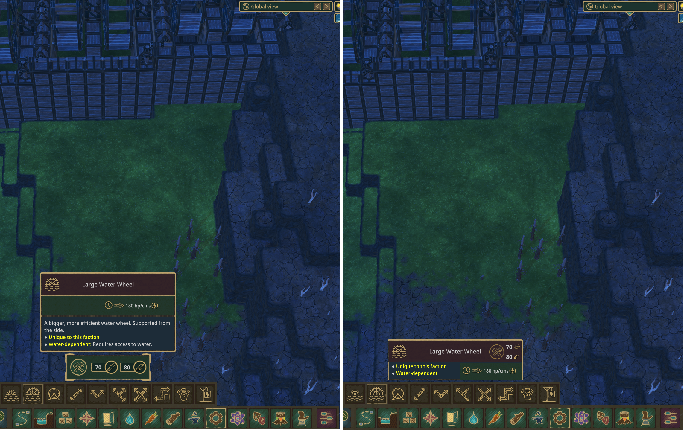
Tofu MergedOn the build menu, buildings have their characteristics stack vertically. On certain buildings such as excavator and water wheels this took up more vertical screen space than needed.
Existing buildings have a toggle to hide their description. Build menus should have a similar option too.
It could incorporate a hotkey too for convenience, similar to the one used for water visibility(T).
-
07 Jun, '23
Gin Fuyou System"Option to reduce some clutter on UI by hiding description on build menus" (suggested by Tofu on 2023-06-05), including upvotes (1) and comments (0), was merged into this suggestion.
-
31 Oct, '23
Anonymous MergedWhen selecting what to build the materials required and description pop up into the center of the screen. This is very annoying because I frequently have to adjust the view...again to place the item. Most, if not all, modern computers are now wide screen. This means that the center of the screen is at a premium and should be should be clutter free. Please put the into off to the side or offer a setting to do so.
-
02 Nov, '23
Gin Fuyou System Merged"UI Improvement Suggestion" (suggested by Anonymous on 2023-10-31), including upvotes (1) and comments (0), was merged into this suggestion.
-
23 Jan, '24
Wolltich MergedWhen I find a suitable construction site, I like to position it just below the center of my screen. My sweet spot for the best view. Then, with activating the menu bar, the following pop-up covers exactly my designated construction site and I have to reposition. Maybe these pop-ups could be placed off-center.
It´s just a smaller inconvenience in a great game. -
23 Jan, '24
Gin Fuyou System"Off-center position for construction bar pop-ups" (suggested by <Hidden> on 2024-01-23), including upvotes (1) and comments (0), was merged into this suggestion.
-
06 Feb, '24
Siccius MergedWhen selecting an item the info card at the bottom of the screen blocks way to much. Imo it should be on the side of the screen somewhere. Specially on ultra wide very annoying.