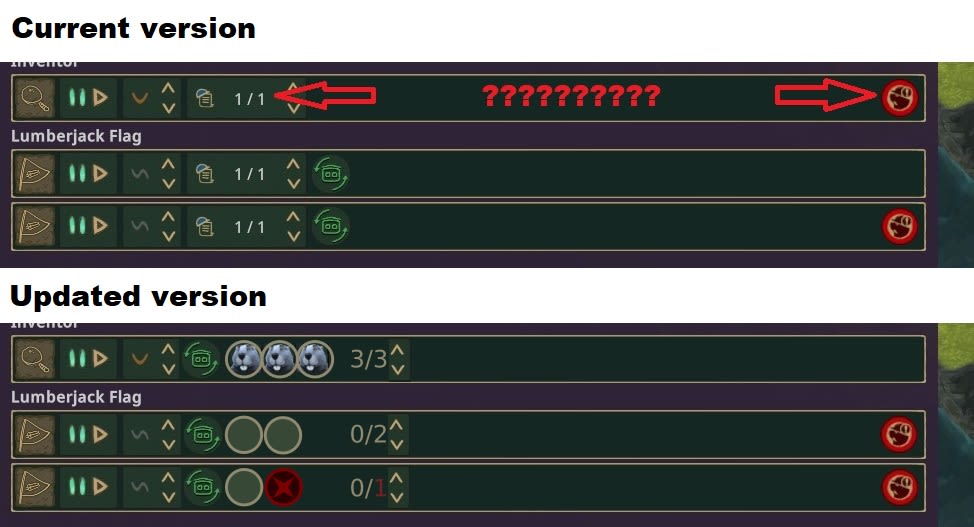
New employment screen - changes for better visual representation and more intuitive control.
Right now the workplaces screen lists all buildings and alows to see their priorities pretty easily. Unfortunately the jobs are still a confusing mess and even when there are no beavers working, the game displays 1/1 or 2/2 etc., which looks more like there are all positions filled, but they're not.
I suggest changes as follows:
- Change the numbers to mean (Workers)/(OPEN positions)
- Display the (Open positions) count in red wherever there are some disabled positions
- Display portraits of beavers wherever a position is taken
- Display an empty "spot" wherever there is an available position
- Displayed a crossed out/greyed out/red (whatever the team decides to be a "inactive workplace" indicator) for positions that were closed/limited.
Additionally:
- Allow clicking on portraits to manually "fire" a beaver (makes him unemployed and assigned to a different job)
- Allow clicking on open positions to close them (for intuitive redundancy with arrows next to the counter)