Standardize positions of Ok and Cancel Buttons
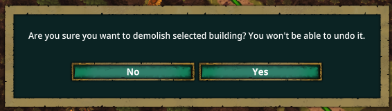
For some reason, the cancel button is on the left for the whole demolishing thing but it's on the right for naming beavers and automation sensors. I never noticed it because I never had to rename a beaver, but with the addition of automation it has become an issue where I just blindly press the cancel button instead of ok because I had gotten used to it being on the right. I don't really see why it is one way for one action and another for the same action for a different purpose. Any way to standardize these things or even just highlight the buttons one color or another based off of which one is yes or no. It's just annoying going through like 20 sensors and renaming them and then finding out you were pressing the cancel button every time. (Yes, I know there's a key binding for accepting, but why do this to us? The fact that the yes and no buttons aren't in the same place everywhere is confusing and a bit irritating.) Pictures Attached. Sorry terminology isn't consistent throughout.


Comments: 17
Oldest
•
Newest
•
Most likes
•
Fewest likes
-
29 May
Gin Fuyou SystemHighlighted comment
"Flip Yes and No buttons on science dialog" (suggested by <Hidden> on 2026-05-29), including upvotes (1) and comments (0), was merged into this suggestion.
-
17 Sep, '21
Wojtek MergedI might be a man of old date (although not that old), but whenever I have LEFT and RIGHT buttons I tend to click left to continue. I know you might want to aggro more people in here this way, but I am not sure if getting a lot of opinions without solid reason. Moreover, it hides the game and makes it annoying to maximize again. Painful experience it is.
-
28 Sep, '21
chan3 MergedSwap the "Save game" and "cancel" buttons on the "Save game" menu
In most games and UIs in general, the button to confirm is on the right. -
29 Sep, '21
pmduda System Merged"Move Share Feedback to right side" (suggested by Wojtek on 2021-09-17), including upvotes (1) and comments (0), was merged into this suggestion.
-
02 Oct, '21
S9ilent MergedAs an alternate suggestion to the original post, it would help a lot of the dialogs where colour coded (e.g. Red delete+Grey Cancel, green next-grey back etc)
Additional info: most windows apps have confirmation on the left and cancel on the right; where as most mac and linux apps are the other way around. -
06 Oct, '21
Jeff MergedMenus are not consistent, with Yes (Right) / No (left) , and Ok (left) / Cancel (Right)
-
12 Oct, '21
AndresE MergedDialogs: place default button on the right side. Save game: NOK
(OK: exit game and delete) -
13 Oct, '21
Gin Fuyou System Merged"Default button - Right" (suggested by AndresE on 2021-10-12), including upvotes (1) and comments (0), was merged into this suggestion.
-
01 Jun, '23
Grey MergedIt's disconcerting that you can right click to close any interrogation screen, but the fly-in windows from the left all require that an X be clicked to dismiss. Right click to close a menu/interrogation/options should be consistent in the entire system or the x should be chosen as primary, but don't half-ass it. Only the esc menu should disallow the right click to dismiss. This type of ux would also be more in line with game industry standards, as seen in Pharoah from 1999 and onward.
-
29 Jun, '23
Daniel MergedThis is a windows OS standard and many people are used to it.
Standards are there for a reason: Users are more likely to get things right the first time.
Confusing the user leads to subconscious frustration.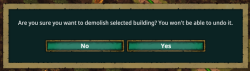
-
08 Jul, '23
Gin Fuyou System Merged"UX: Please swap Yes & No buttons on confirmations" (suggested by Daniel on 2023-06-29), including upvotes (1) and comments (0), was merged into this suggestion.
-
15 Mar
Jcheung System"OK / Cancel buttons not consistent" (suggested by <Hidden> on 2021-10-06), including upvotes (5) and comments (3), was merged into this suggestion.
-
15 Mar
Jcheung System"Swap UI Cancel and Confirm buttons in various places" (suggested by <Hidden> on 2021-09-28), including upvotes (3) and comments (5), was merged into this suggestion.
-
16 Mar
anippitaWow. That's a lot of merged suggestions (That's not just me, right? Posted this suggestion today, March 15th, and there are 12 other merged suggestions here now some dating to September of 2021... crazy). If it was such a big problem in the past, why has it taken half a decade to fix? I'm kind of confused... Also, if need be it might be nice to have a setting to switch the sides of the buttons depending on what you're used to. Some of the merged suggestions said have the ok button on the right and others said to have it on the left, so might be nice to be able to choose. IDK, would just be a QOL thing for those gamers who are picky about their button placement. Personally, I don't really care: I just want one side to be yes and the other to be no no matter where in the game you've got to decide which one to press.
-
21 Mar
Muffin MergedThe "No" and "Yes" buttons when confirming actions (like demolishing) and the "OK" and "Cancel" button when renaming automation signals are opposite to each other. By this i mean that the "Cancel" button on automation is in one the same spot as the "Yes" button for regular confirmations. Took me 5 tries to rename a whether station, could not figure out why it did not rename until my girlfriend pointed out that i was clicking "Cancel" after renaming over and over like a dummy. Some consistency in the button placement on confirming actions would be a great QOL change.
-
22 Mar
Jcheung System"QOL Consistency in Confirmation button placement" (suggested by <Hidden> on 2026-03-21), including upvotes (1) and comments (0), was merged into this suggestion.


-
29 May
Donald MergedHello,
The Yes and No buttons on the Science unlock dialog break common UI conventions in that Yes should be on the left and No should be on the right. I keep accidentally clicking to unlock a science I don't want to actually unlock because of this. This is particularly troublesome when I am using a language I do not know well as an attempt to immerse myself in that language, because UI conventions are a common clue to how the dialog should behave.
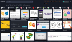
Attached is the in-game dialog box and then a Startpage image search of yes and no dialog box options.